
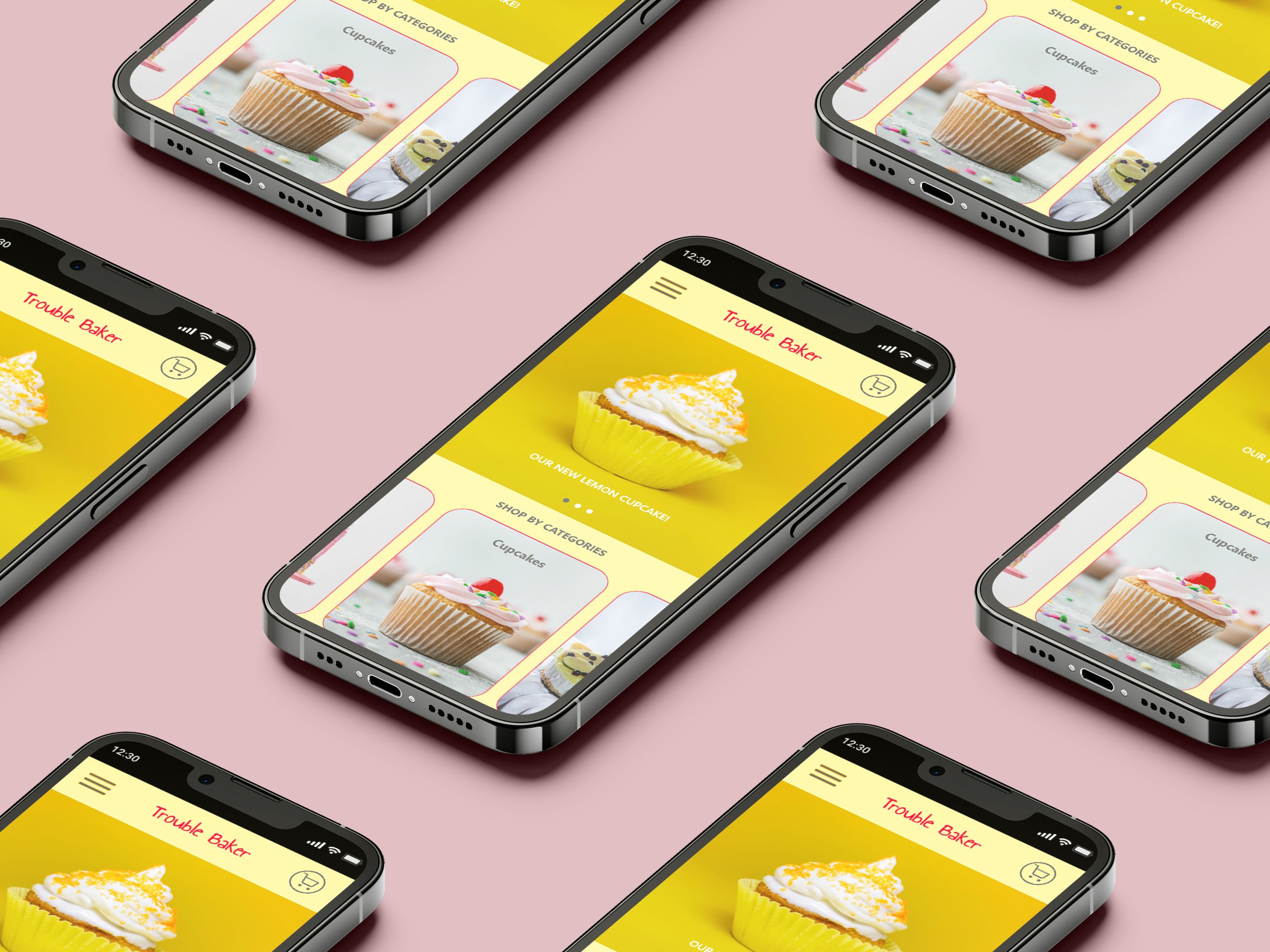
Trouble Baker:
Case Study
Project Goal: Design a responsive website for Trouble Baker, a bakery catering to users with food restrictions and specific diets, allowing them to filter products by ingredients and order in advance for pickup.
Platforms:
Web Desktop and Mobile
Tools:
Figma
Role:
UX designer
Project duration:
May 2023 - June 2023
This was a prompt created within the scope of a UX Design professional certificate.
The goal was to design a shopping experience for a favorite bakery by creating a responsive website.
I picked this prompt because I actually love baking.
Red velvet cupcakes are my specialty!


Problem
and Goal
There aren’t many available online websites for bakeries, they have inefficient systems for browsing through products, lack of filters for food restrictions and options to order in advance for pick up.
I needed to design a user friendly website for the bakery, by providing clear navigation and offering a filter system for ingredients and allergens, and a product that allows users to order in advance.
User
Research
A primary user group identified through research was busy young adults who want to order in advance and choose a time for pick up.
This user group confirmed initial assumptions, but research also revealed that not being able to order in advance was not the only factor limiting users.
Other user problems included food restrictions and diets, and not having options for those conditions when shopping.
Users had trouble finding an online bakery that provides ingredients and nutritional information, as well as a good shopping experience that would allow them to order in advance and pick up the order.
-
User Research
I conducted interviews and created empathy maps to understand the users I’m designing for and their needs. A primary user group identified through research was busy young adults who want to order in advance and choose a time for pick up.
This user group confirmed initial assumptions, but research also revealed that not being able to order in advance was not the only factor limiting users.
Other user problems included food restrictions and diets and not having options for those conditions when shopping. Users had trouble finding an online bakery that provides ingredients and nutritional information, as well as a good shopping experience that would allow them to order in advance and pick up the order.
Pain Points
Experience: Bakery websites don’t provide an engaging browsing experience
Navigation: Bakery websites lack of essential filters for diets and user flows.
Process: Users aren’t able to order in advance and choose a date and/or time for pick up.
Persona
Problem statement: Sarah is a busy vegan young adult who needs to place an order in advance and search filters because they want vegan food and to save time.
User Journey Map
Mapping Sarah’s user journey helped me identify possible pain points and improvement opportunities.
It revealed how helpful it would be for users to have access to a website dedicated to filter ingredients from the bakery.


Website
Navigation
My goal was to make strategic information architecture decisions that would improve overall website navigation.
I sketched out paper wireframes for each screen, keeping the user pain points about navigation, process, and checkout flow in mind.
For the home screen, I prioritized a way to select products from different options and filters.
Because customers access the website on a variety of different devices, I started working on designs for additional screen sizes to make sure the site would be fully responsive.

-
Difficulty with website navigation was a primary pain point for users, so I used that knowledge to create a sitemap.
My goal here was to make strategic information architecture decisions that would improve overall website navigation. The structure I chose was designed to make things simple and easy.
-
Paper Wireframes
Next, I sketched out paper wireframes for each screen in my website, keeping the user pain points about navigation, process, and checkout flow in mind.
For the home screen, I prioritized a way to select products from different options and filters.
Because customers access the website on a variety of different devices, I started working on designs for additional screen sizes to make sure the site would be fully responsive.
Digital Wireframes
Moving from paper to digital wireframes made it easy to understand how the redesign could help address user pain points and improve the user experience.
I made sure to base screen designs on feedback and findings from the user research.
Easy navigation was a key user need to address in the design.
Low-Fidelity Prototype
Using the completed set of digital wireframes, a low-fidelity prototype was created.
The primary user flow connected was selecting a product based on specific filters and place an order for pick up, so the prototype could be used in a usability study.

-
Based on the insights from the usability study, I made changes to improve the site’s user flow.
The first one was renewing the page after selecting a filter. Another change I made was adding the option to edit the quantity of items in a cart using a “-” or “+” button.
It was also added a go back option to every page.
To make the checkout flow even easier for users, I added checkboxes that allowed users to use the same address for billing and shipping or add a different one.
I included considerations for additional screen sizes in my mockups based on my earlier wireframes.
Because users shop from a variety of devices, I felt it was important to optimize the browsing experience for a range of device sizes, such as desktop and mobile so users have the smoothest experience possible.
-
My hi-fi prototype followed the same user flow as the lo-fi prototype, and included the design changes made after the usability study.
Accessibility Considerations
I used headings with different sized text for clear visual hierarchy.
I used accessible web color combinations and contrast for users with color blindness.
I designed the site with alt text available on each page for smooth screen reader access.
Design
Systems
I made sure to create reusable components that foster a consistent user experience.
Use of headings with different sized text for clear visual hierarchy.
Use of accessible web color combinations and contrast for users with color blindness.


Color Palette
Primary palette

Secondary palette
Typography

Iconography


Takeaways
Impact:
The website is intuitive to navigate through and really thinks about how to meet the user’s needs and flows.
One quote from peer feedback:
“Four steps - simple and linear. This is visually well structured.”
What I learned:
I learned that even a small design change can have a huge impact on the user experience. The most important takeaway for me is to always focus on the real needs of the user when coming up with design ideas and solutions. Usability study and peer feedback helped me identify my own bias and influenced each iteration of the designs.
Next Steps
1
Conduct follow-up usability testing on the new website
2
Identify any additional areas of need and ideate on new features
